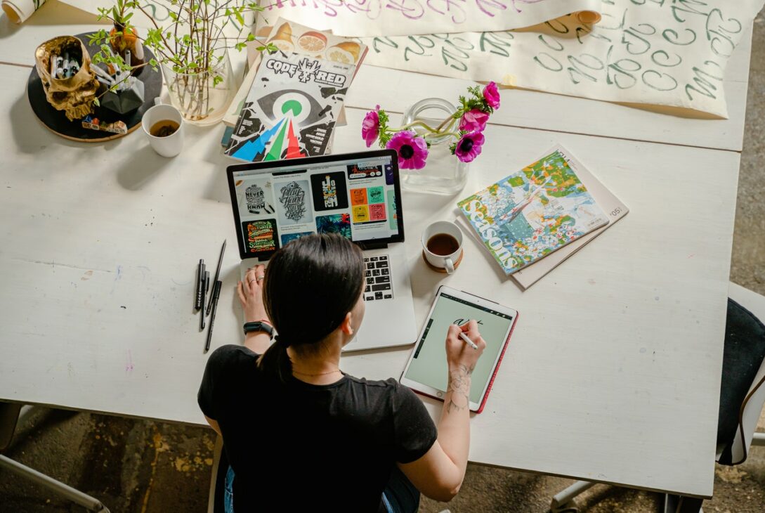
Icons and images work together to set the standard for your customer’s interaction and allow them to absorb the brand’s personality and ethos. Icons serve as graphic accents in multimedia designs. When designing for a digital brand, you or the designer must strike a balance between creatively novel and thrilling design and sharing all the necessary information. Freelance Bazar has enlisted 9 keys to use icons and images in your digital design.
Highlight important points.
Bullet points and numbered lists, two of our favorite spring-cleaning tools, help to declutter text. They highlight key points and takeaways by separating information from the rest of the text body. Iconography is a more innovative alternative to the traditional list style. Creating one-of-a-kind icons to further the brand’s branding and visually convey your message keeps the mood light and bouncy for your reader. It not only explains this valuable detail in a lighthearted, easy-to-read manner, but it also has personality and reflects the brand’s ideals.
Brand diagrams and maps
Certain projects lend themselves well to being text-heavy, but other informative material, such as infographics, necessitates a more visual approach. One advantage of iconography is that it helps readers to visualize the text, which is particularly useful when communicating data or statistics. Freelance Bazar suggests you keep in mind is that you can only use symbols that are hyper-relevant to the point, or else they will not make sense. You are not only adding icons to add icons; you are doing so to make your templates more understandable and visually pleasing. By replacing written statistics and names with a map labeled with graphic logos, a simpler, more usable, and thus more effective interface is created.
Display stability
There are several different types of icons to choose from, such as flat, outline, isometric, and more, that it can be difficult to decide where to begin. Freelance Bazar has compiled a list of items to consider when selecting or creating an iconography for your project. Finding the best look, color, and scale is critical for brand continuity and reflection.
Icon or Logo design
Since there are too many different icons designs to pick from, it is important to adhere to a single icon or logo design regardless of which one you pick.
Color of the icon
Color is another critical feature of icon or logo design continuity. Although some contexts necessitate that icons maintain sensible colors, it is often more interesting to be imaginative.
Size of the icon
The scale of icons is another important factor to remember when incorporating them into your design work. Consider if the message they are conveying is just as important as the other points. If you want the reader to think of each one equally, the scale of your icons or logo design should represent this, just as each feature in a design project should be streamlined together. Using the same sized circles creates a consistent look around some of the more unusually shaped icons.
Include a background.
However, to make the iconography pop, you may want to add an extra contrasting layer to the logo design, which involves adding a backdrop. Aside from the standard spherical forms for backing the icons, there are a few other innovative options to consider, such as sizing, form, spacing, and transparency.
Contemplate animation into your icon.
Ticking, twitching, or shaking brings drama and effectively expresses the logo design message. Enable the classic ideas to be infused with an excess of imagination.
How to Make the Most of Your Image
Imagery catches the eye; it entices users to click on your call-to-action and provides an enhanced experience. Not only that, but they visually communicate your brand’s story and ethos. Featuring images that contrast and complement white space and brand colors are so essential in design that you must get it just right to stand out from the crowd. So, in this regard, Freelance Bazar has brought together five different ways for expressing imagery in your projects.
Snipping or Cropping
Cropping pictures into geometric forms and creating creative patterns is a great way to integrate them into your creations. You might begin with something simple, such as a rectangle, circle, or triangle, and then experiment with the dimensions to find the best match. If it is a geometric pattern, like a logo design then you might even experiment with tiling, with certain shapes exposing the image and others packed with complementary/contrasting block colors.
Background Filling
Filling a backdrop with an illustration provides an aura and invites the reader to engage with the brand more deeply. You can experiment with various methods, such as displaying text over a picture with a translucent box but make sure to use contrasting colors and placement to keep it easy to read.
Templates with cutouts
Make a picture cutout by slicing away the parts you do not use. This strategy gives you a lot of flexibility so you can incorporate its key function into your design without worrying about the edges of a square/rectangular picture looking uncomfortable. It also allows the website to accept white space. Play about with it to see how many close picture cutouts you can find. You may also put your picture cutout over a portion of your text to add dimension to your design.
Try doing Collages.
It is the ultimate alternate mode to present images from, and it is a great way to tease or playfully influence the material. Experiment with compositions, but make sure it fits in with the overall brand name and paint or color palette.
Include a basic transition.
A basic motion transfer enhances interactivity between the platform and the user, creating a memorable experience for the user while also providing another opportunity to convey individual brand identity.
Conclusion
Choosing the right symbols and imagery, as well as learning how to use them to suit the desired brand style, is a task. Experimentation is the optimal way to perfect your digital design.